Hello, I'm Holden Colclough.
I'm a graphic designer and illustrator with experience in pharmaceutical design, branding, and logo design. You can view my work below to get an understanding of my creative process and outcomes.

Vetoquinol

Illustration

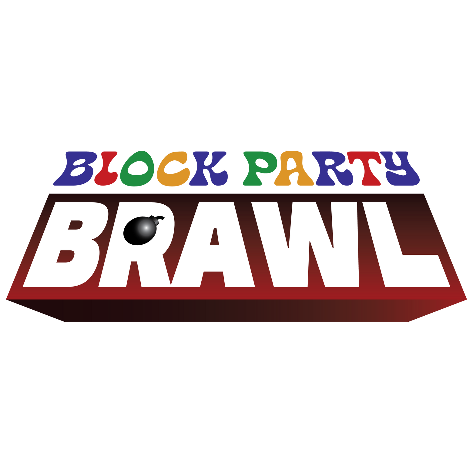
Block Party Brawl

Pet Vac Animal Hospital


At Vetoquinol, I've developed digital ads and print-ready designs, balancing brand guidelines, performance-driven layouts, and production specifications across multiple formats.

Flexprofen flyer promo

Flexprofen tablet ad

Flexprofen cashback ad

ZylkenePLUS ad

Zylkene cashback ad

Zylkene web banner ad

NexHA cashback ad

Imoxi cashback ad

Phovia eurofit banner

NexHA web banner ad


Many of my illustrative works draw inspiration from the colorful aesthetics of the ’80s, ’90s, and early 2000s - think Memphis design. My "goal" is to pull viewers into environments that feel playful yet strange, encouraging exploration and curiosity.


Pet Vac Animal Hospital logo redesign

Before

After


For this logo redesign, I researched typefaces that better reflected Pet Vac's professionalism and friendliness. I expanded the typography system and recreated visual elements found across different branch logos to unify the brand into a more cohesive identity.
Additional logo (for specific branch)

Website mockup


I'm Holden - nice to meet you!
I’m an illustrator / graphic designer based in Columbia, SC, and I graduated from the College of Charleston in 2025 with a BA in Computing in the Arts. I’ve been drawing for as long as I can remember, and eventually those skills translated into illustration and design. I enjoy creating work that blends personality with clarity, whether that’s through branding, character design, or visual storytelling. My background in both art and technology allows me to approach projects with a balance of creativity and problem-solving, focusing on designs that are both engaging and functional. I’m especially drawn to projects that involve playful visuals, strong visual identity systems, and opportunities to bring ideas to life through illustration.If you'd like to collaborate, request my services, or just say hi - email me at [email protected].
Branding & Packaging DesignTimeline: 3 weeks
Tools: Adobe Illustrator, Photoshop, InDesign, BlenderBlock Party Brawl began as a creative combat party board game concept that evolved into a branding project. The objective was to design a visual identity and box packaging that communicates cartoon violence in gameplay and character-driven playstyles while remaining simple and adaptable.
#1: Logo

Inspiration

Early logo exploration

Logo refinement


When designing Block Party Brawl's logo, I wanted to create something simple enough to work across multiple formats while still conveying the chaotic, combat-driven nature of the game. I also incorporated bold colors and subtle dimensional styling inspired by classic board game logos.

Final logo designs

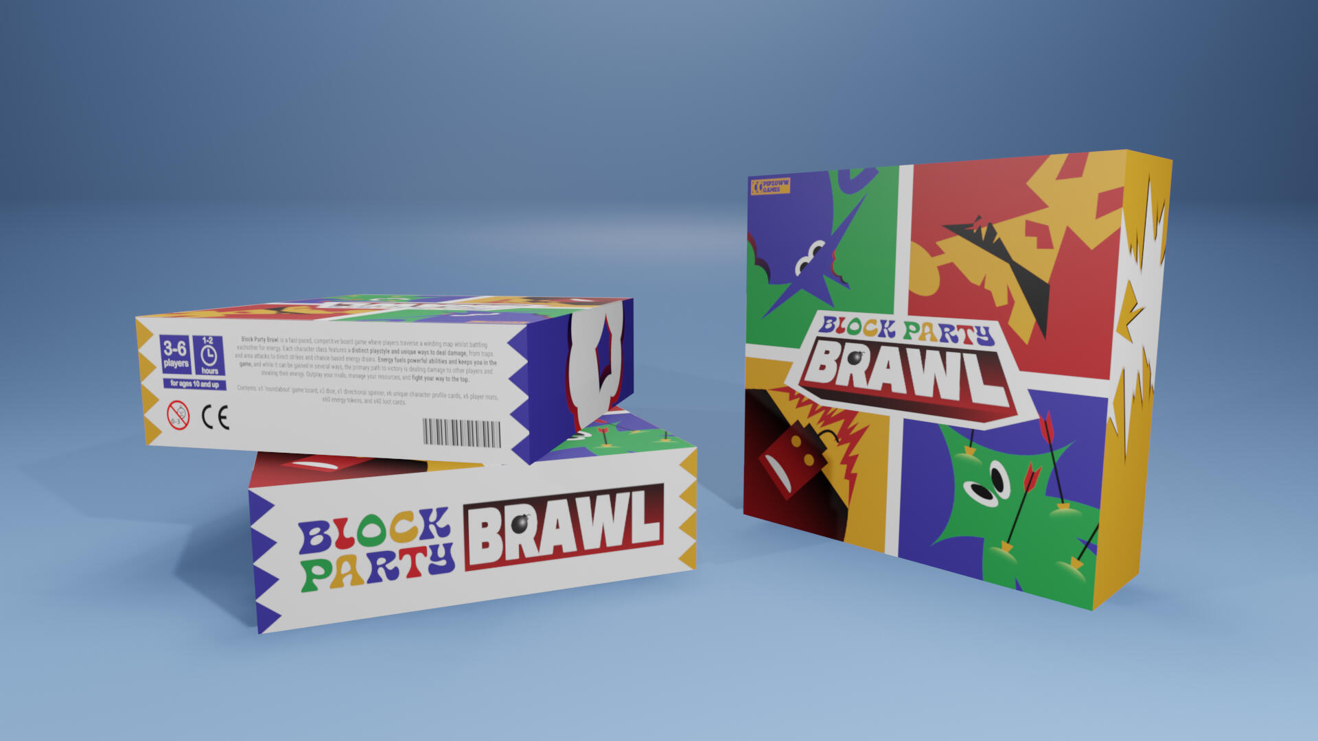
#2: Box design

Early box art sketch #1

Early box art sketch #2

Early box art sketch #3


Varied playstyles through different character classes are a core element of BPB, and I knew early on that this needed to be reflected in the game’s box art.

BPB cast lineup


Final box design (flat/unwrapped)

Final box design (front only)


In the finished box art, I incorporated references to combat without explicitly showing any action, highlighting the game's humor and encouraging the viewer to imagine the moments in between. Visual accents like fire, bite marks, and arrows embedded in characters extend beyond the main illustration and wrap onto the sides of the box, reinforcing the game’s chaotic tone.

Product mockup #1

Product mockup #2

Product mockup #3


#3: Ad campagining

Ad inspiration


single page magazine ad

Instagram ad

Instagram ad mockup


When considering BPB’s target demographic of teens to young adults, I drew inspiration from retro gaming advertisements found in magazines from the 1990s and early 2000s. These ads are known for bold, attention-grabbing visuals and exaggerated marketing language that amplifies the excitement of gameplay, often with humor and self-awareness.